Nelson Orthodontics - Richmond Practice
Project Description & Client Brief
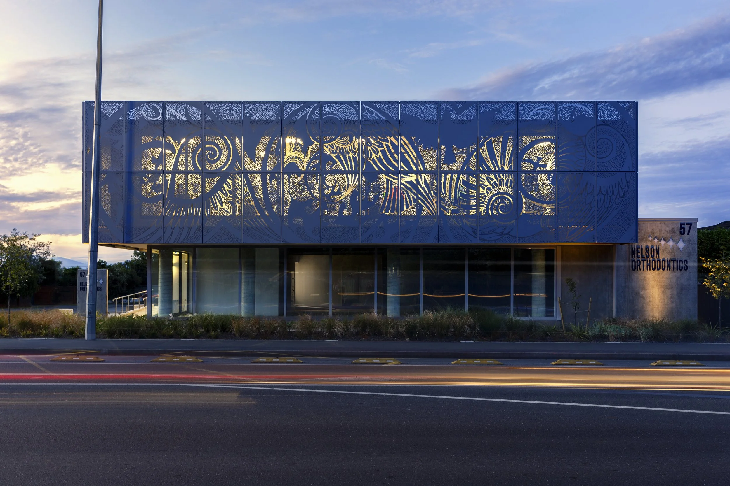
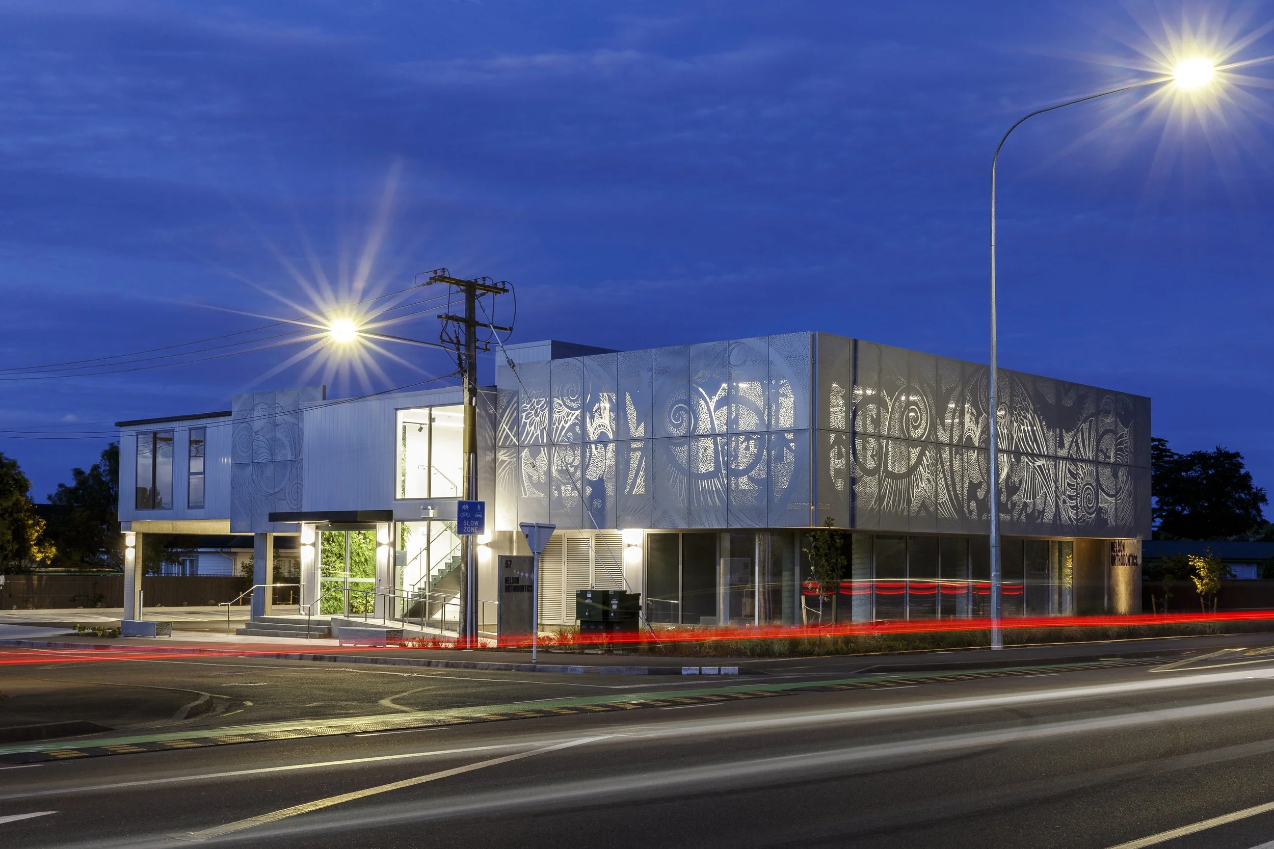
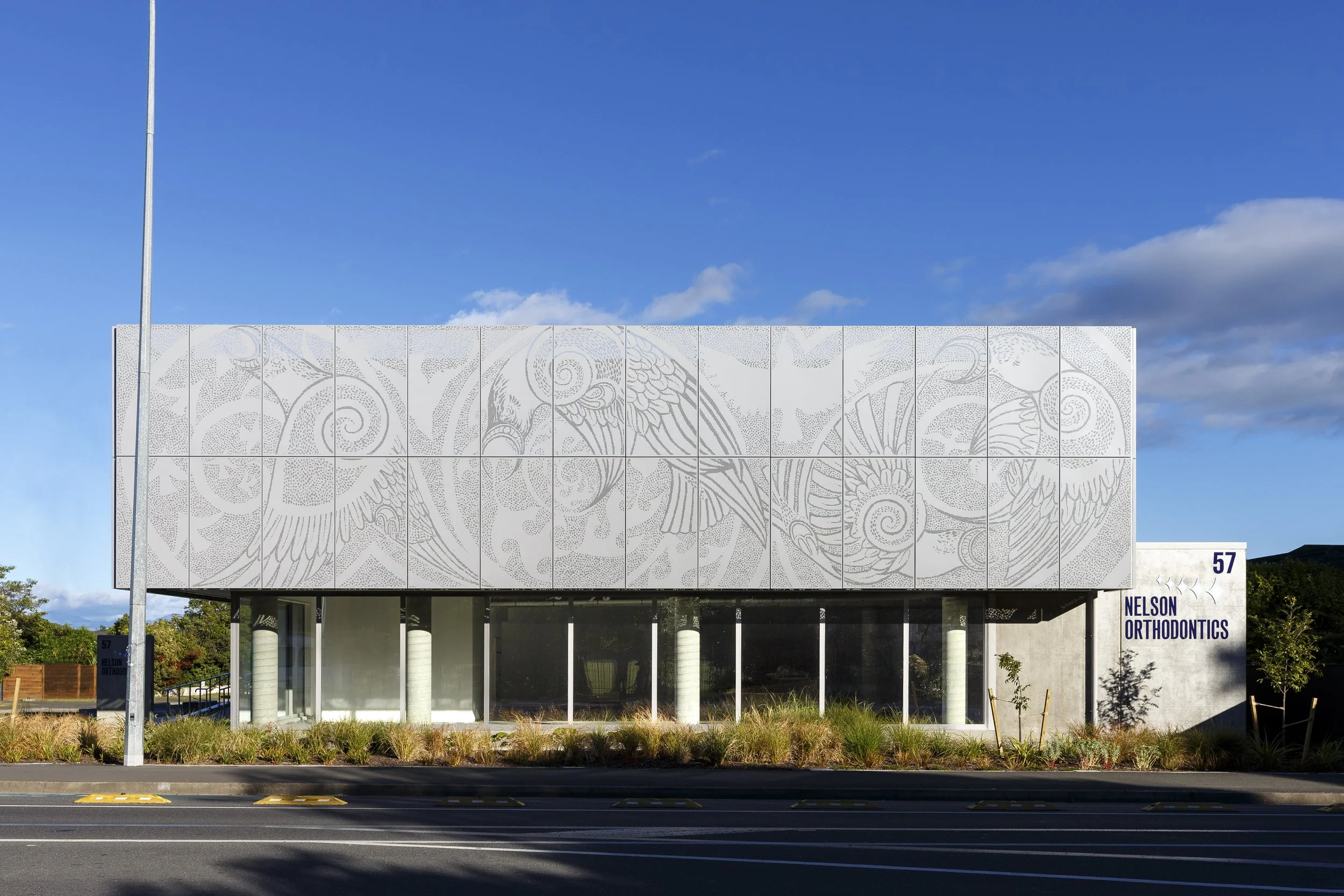
The Nelson Orthodontics project is a response to a client who had outgrown their small, central Nelson clinic. They had been looking to provide an additional clinic for the growing Richmond population and when this residential corner site (with main road frontage) came available it seemed the perfect location to achieve this. It is predominantly younger patients that receive orthodontic work and the close proximity of five surrounding schools meant that travel time for patients would be significantly reduced. The brief was to provide a highly functional and technologically advanced orthodontic clinic with a sense of openness within. Patient flow (for shorter appointments) was an important consideration and an open plan clinic was conceived alongside private consultation rooms for longer appointments. The possibility of additional tenancies for related healthcare providers was desired for an ongoing rental income. Our client was sympathetic to the existing residential built environment and wanted to reduce the visual impact of a commercial building on the site. Our response was a two level building that presents a perforated screen to the street with a bespoke artwork that would give something back to the community.
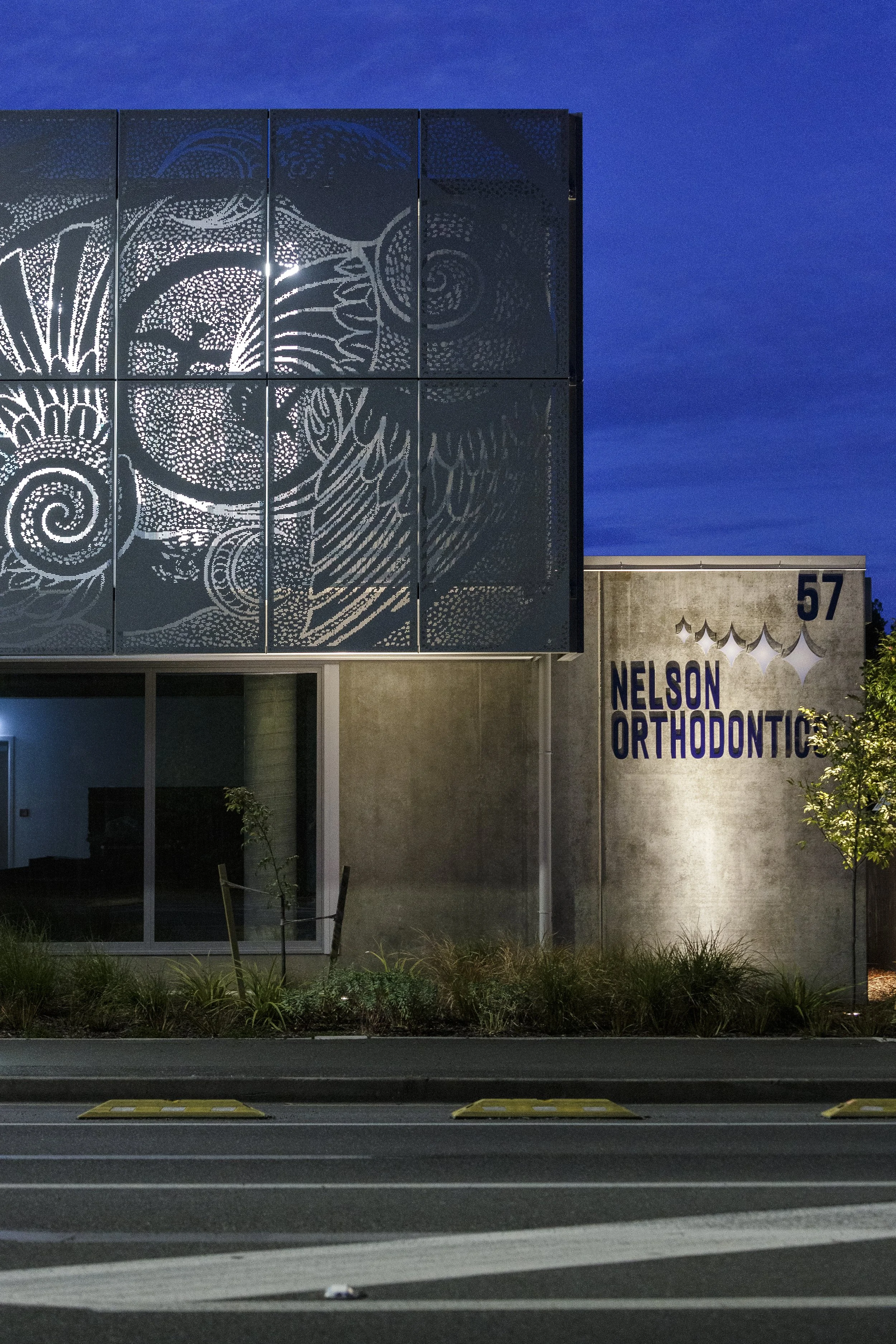
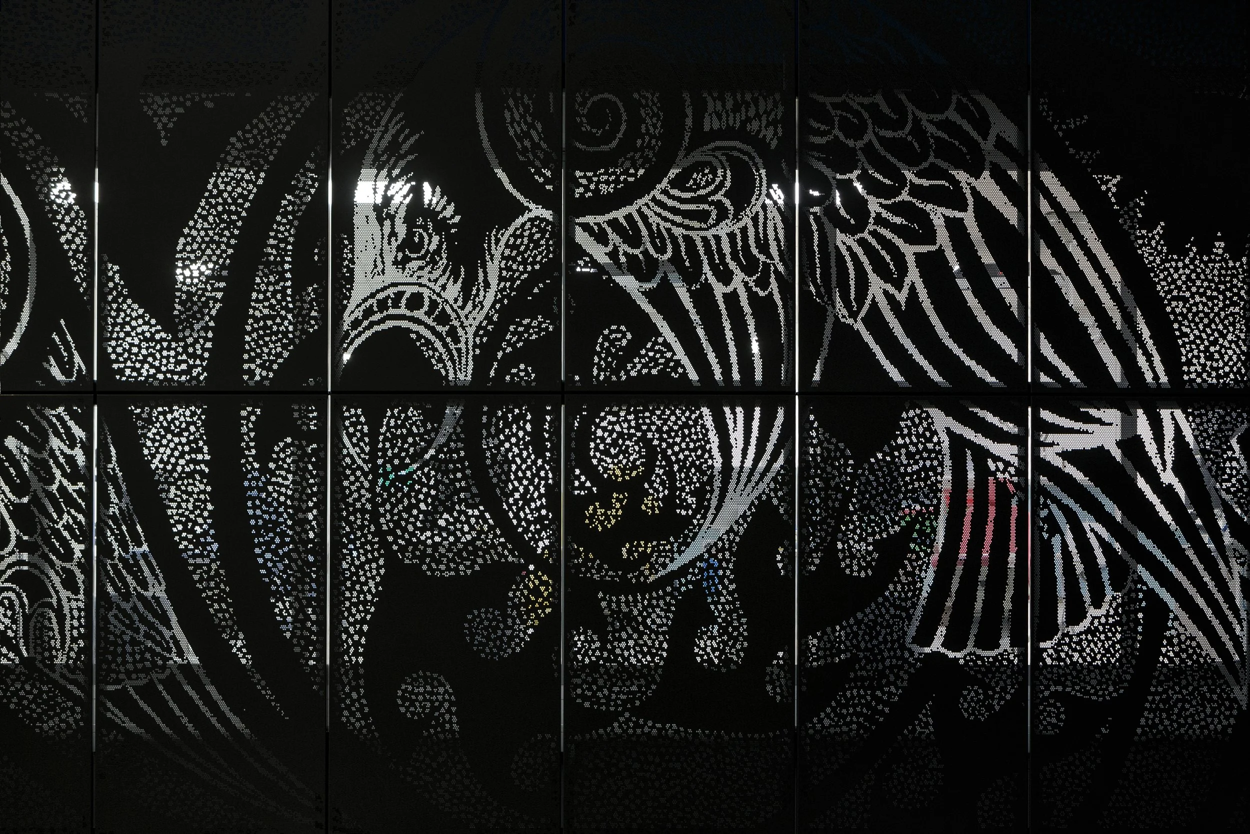
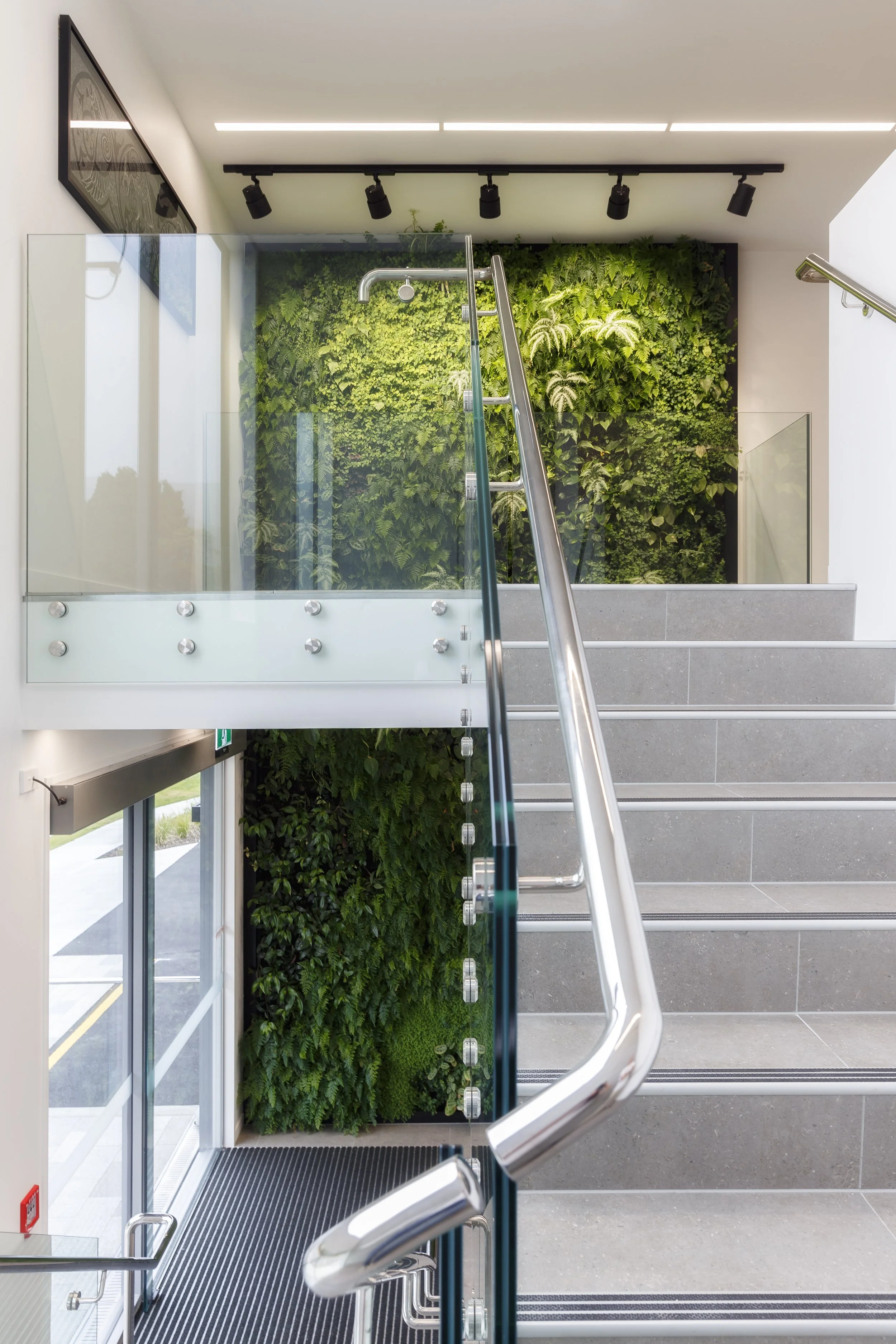
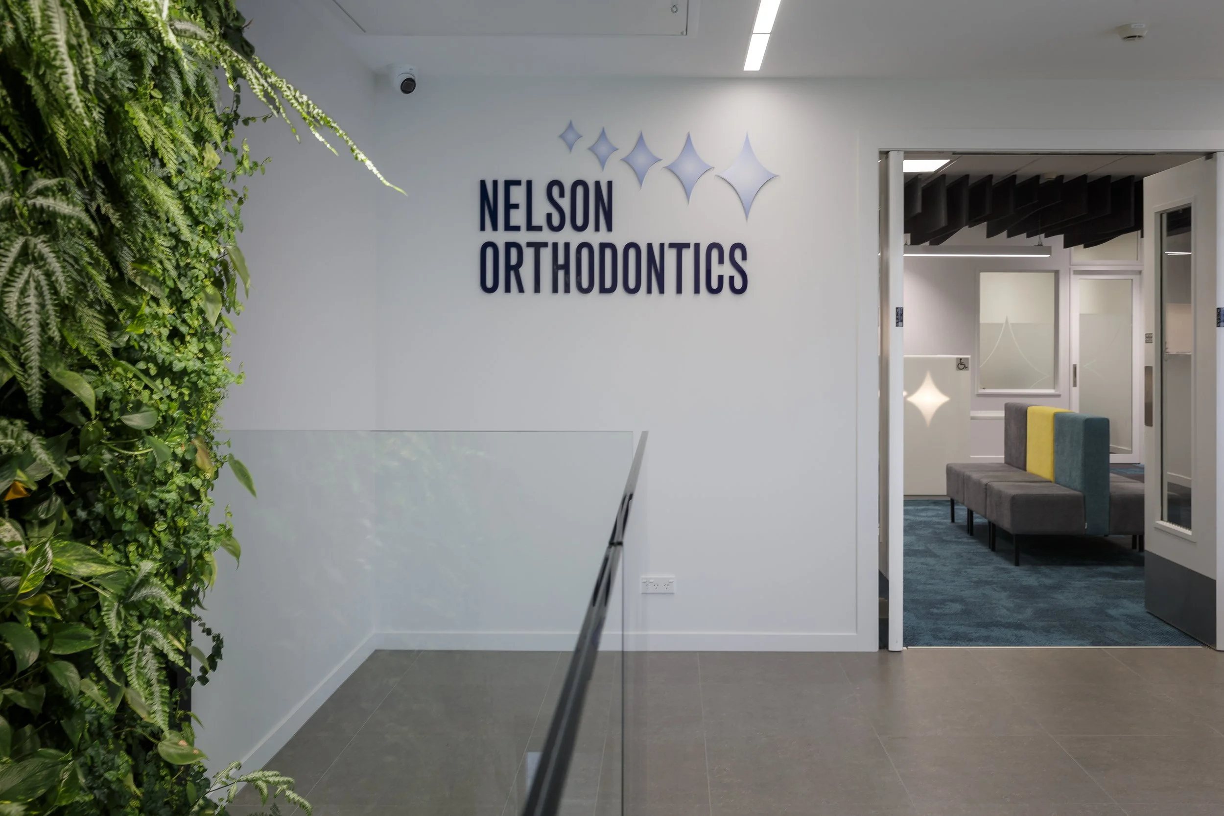
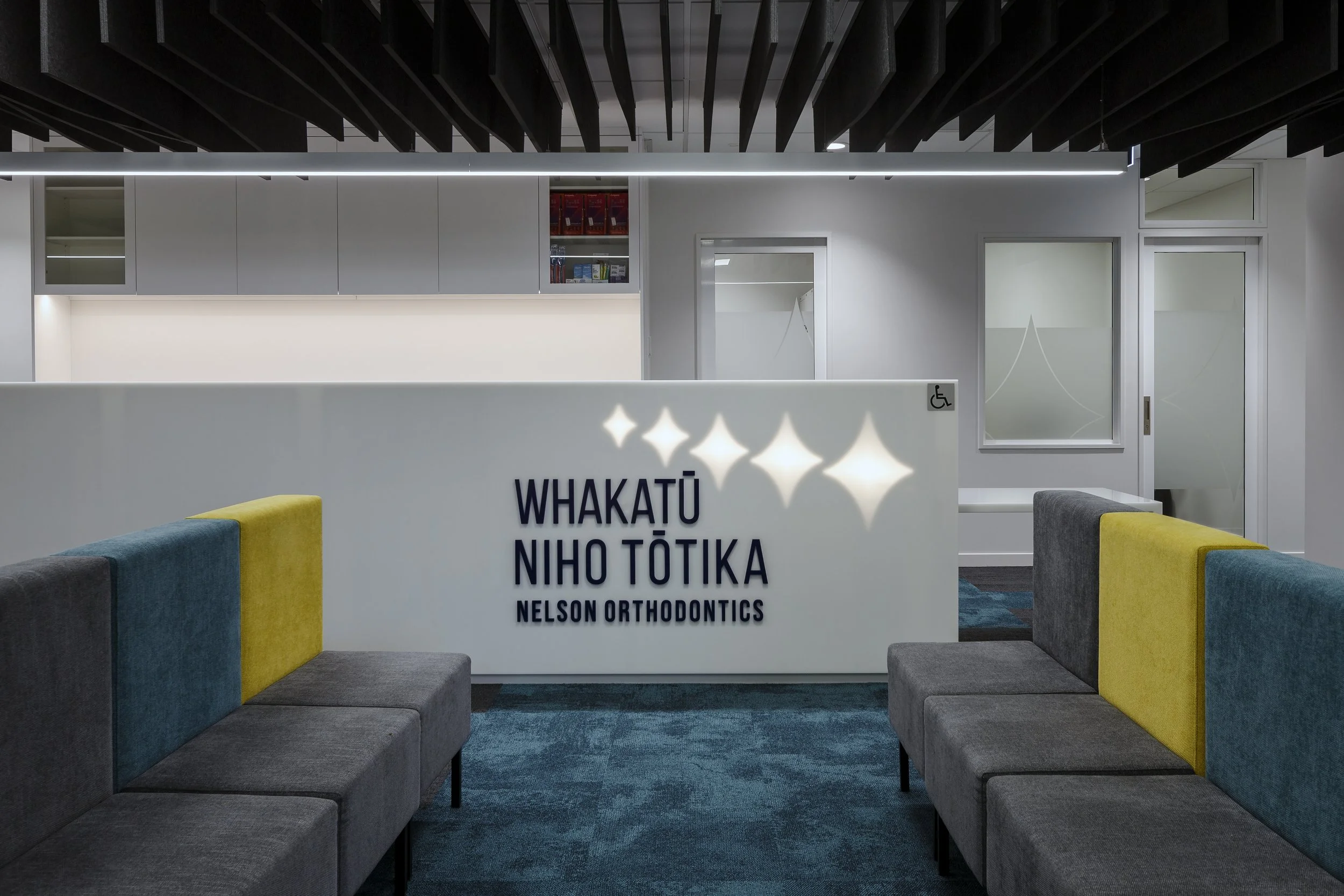
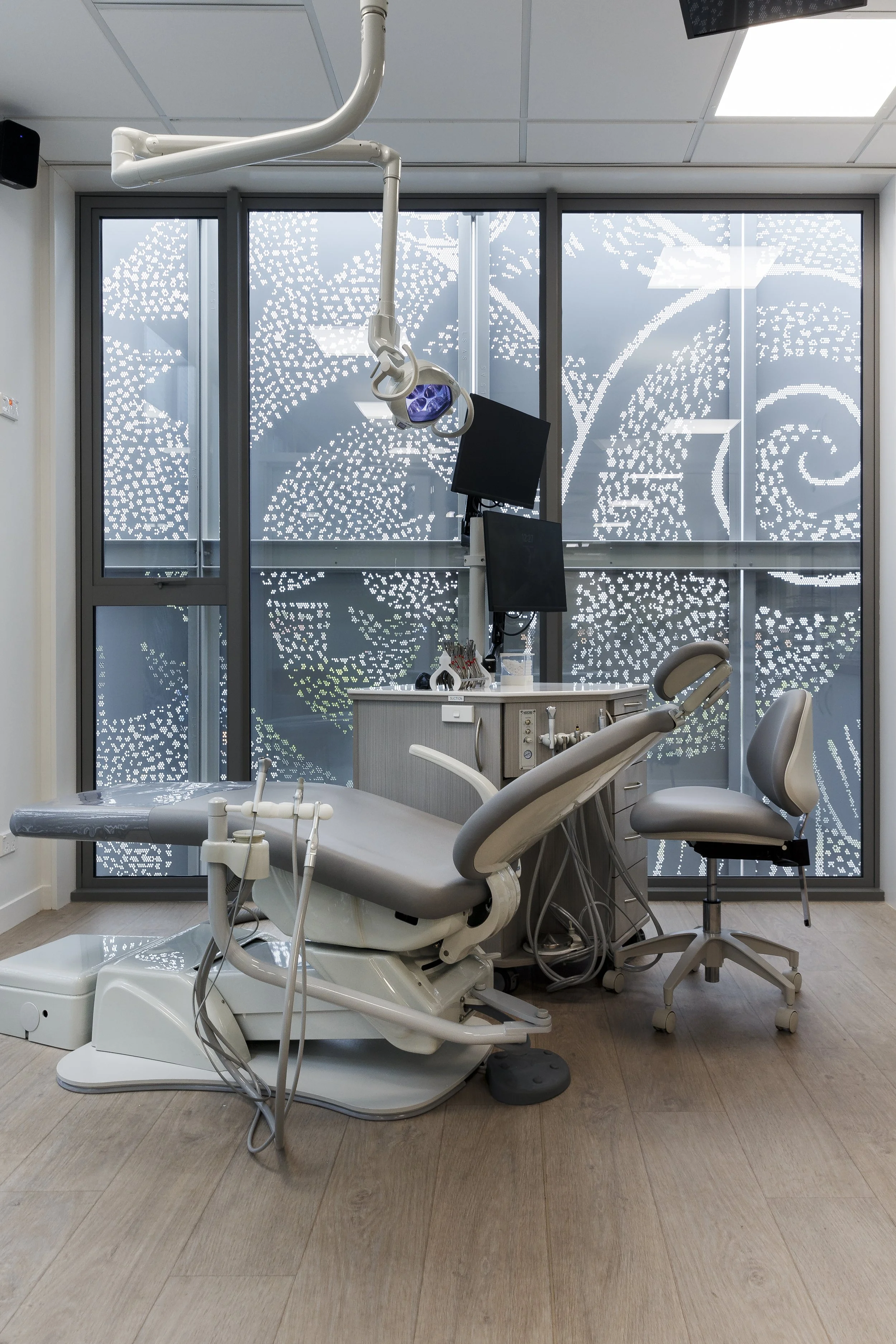
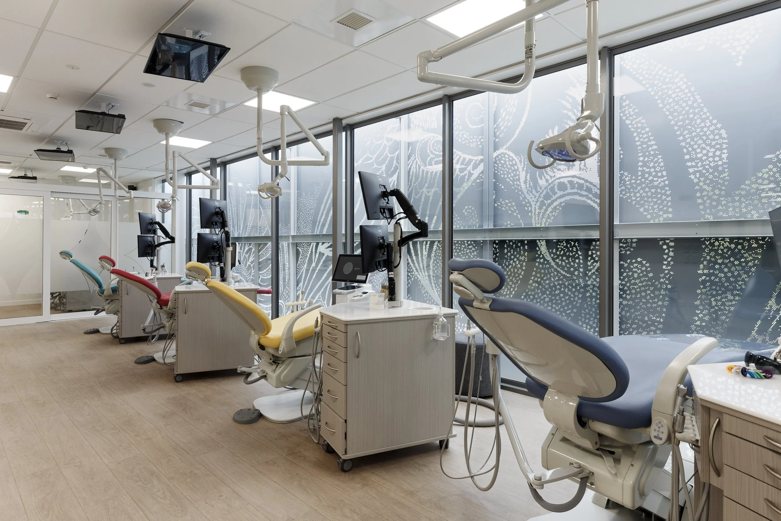
Consultation with Maori artist, Robin Slow resulted in a facade that brings delight. Robin’s work ‘Haumanu’ depicts "Manu (birds) which are our connectors between earth and sky, between the physical and the spiritual. Haumanu is to restore to health, or rejuvenate." From inside the clinic, filtered light and pocket views are other benefits provided by the external screening. Tasked with creating an interior that wasn’t another ‘sterile medical environment’ we set to bring a homely warmth to the space with a living green-wall, pops of colour and oak-look resilient flooring. The result is a space that is filled with energy, creating a highly comfortable interior for both employees and patients alike.
Site & Context
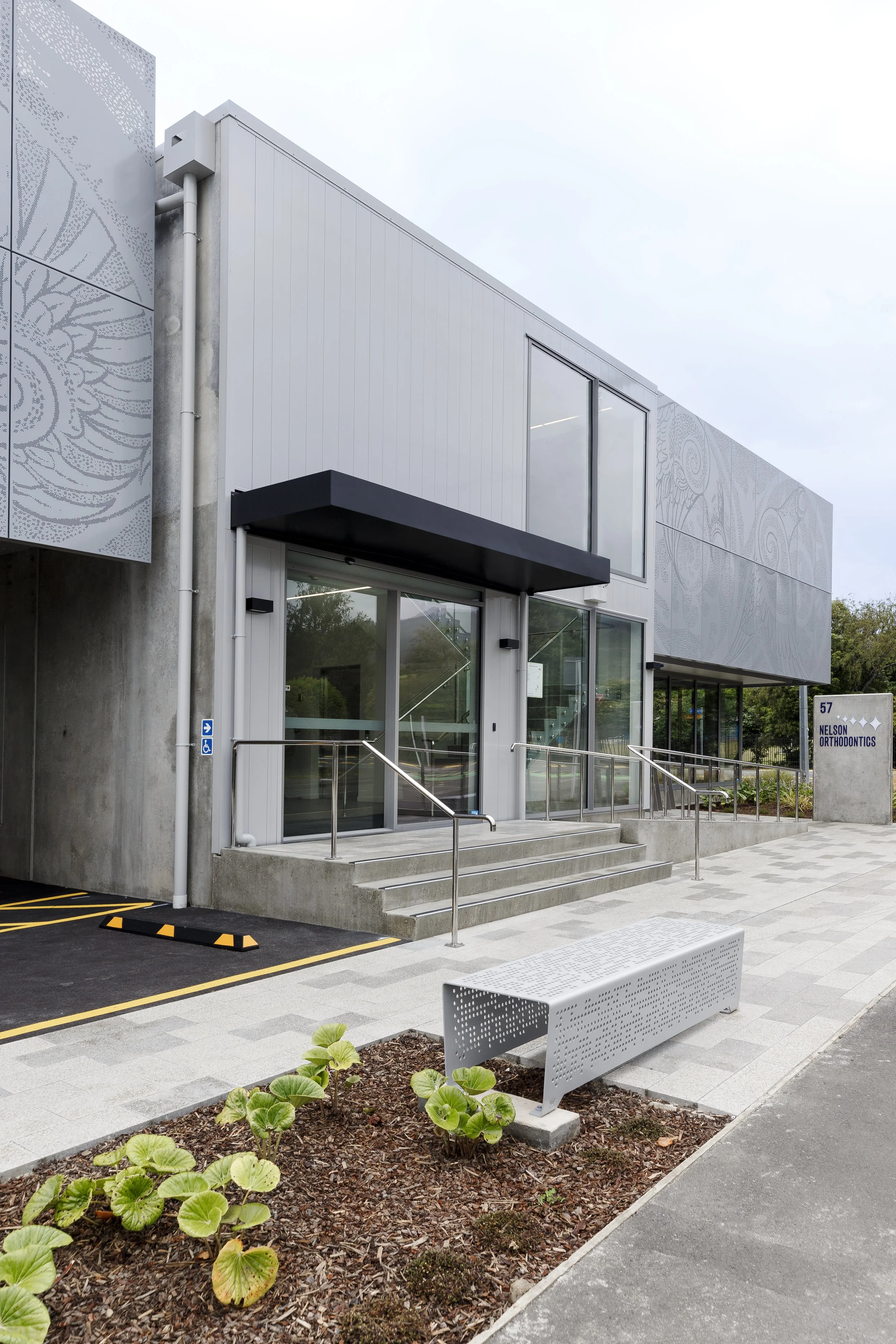
This highly visible corner site on a Primary Collector Road (Salisbury Road) is a flat section only two minutes drive from the centre of Richmond township. With its long edge facing North East, the site receives all day sun with Eastern views to the Richmond Ranges. The context is predominantly residential on the Western side of Salisbury Road with the opposite side of the road home to three school campuses. Significant commercial activity is located on the same road 500m to the South and 800m to the North. The design was kept low and long to reduce the scale of the building to be more in keeping with the residential surroundings. The removal of boundary fences to the street keeps the site feeling open; inviting paved areas and planting were used to accentuate the connection between public and private. The importance of this site as a commercial operation was significant; being the only orthodontist in the Nelson/Tasman region there are patients travelling from Golden Bay and the West Coast. Reductions in travel time of up to thirty minutes each way are being achieved when compared to travelling to the Nelson clinic. By accommodating two other healthcare tenancies the building provides a valuable community facility within this rapidly growing region.
Constraints
Building in a residential zone meant that our involvement extended to the resource consent application along with a separately engaged planner. To make best use of the site for commercial purposes for our client (as well as allowing for sufficient car parking), the design infringed planning rules related to boundary setbacks, height, site coverage and daylight admission. However, the infringements were intentionally kept to a minimum and the overall design of the building was conceived in such a way that the scheme was not out of character within its context. Another requirement of the Resource Consent was that all tenancies were to be healthcare providers. By locating vehicle access on the side street with ample turning space we were able to reduce the effect of the additional vehicle movements. Other constraints were related to noise, overhead power lines and stormwater design. The design locates all plant and equipment in the fully enclosed ground floor plant room to reduce both the visual and acoustic impact. Three 6000L underground stormwater detention tanks were designed into the proposal to reduce the impact of the increased catchment area on the public system.
Material Selection
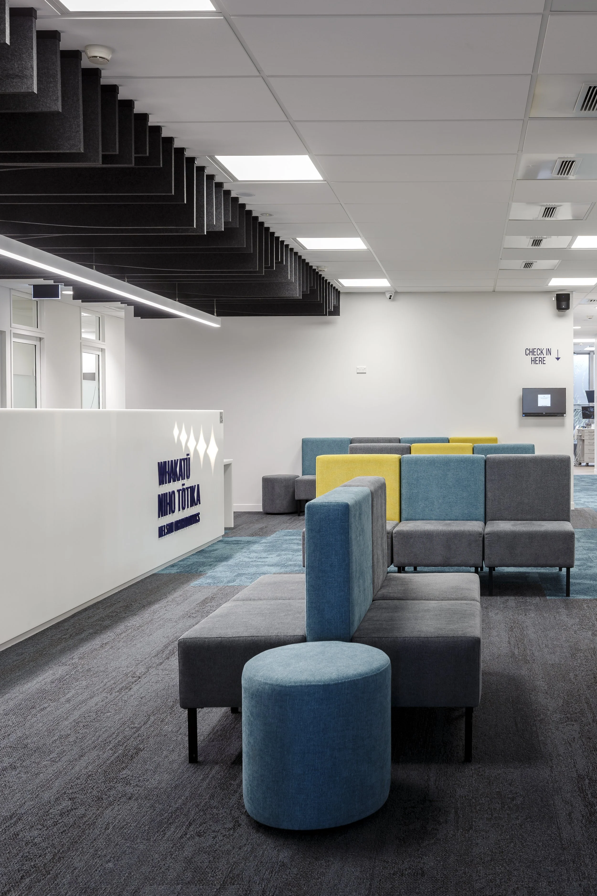
Our material selection was largely driven by the need for low maintenance and building occupant safety. As a health facility the emphasis on a structure that is seismically resilient was paramount. Lightweight and durable powdercoated aluminium weatherboards require very little maintenance and give a refined look. These weatherboards, along with the powdercoated perforated screens are coated with a product that achieves a 25 year warranty. Exposed precast concrete panels are also durable and with an anti-graffiti coating that will stand up to a potentially harsh public environment. A concrete floor slab and mid-floor constructed of precast ribs with timber infill were chosen predominantly to meet the engineering requirements while also having the ability for a service cavity under the dental chairs for electrical/water/air supply and suction. Timber construction was investigated for the project but costs were prohibitive to the development going ahead at the time. A lightweight timber framed first floor wall structure and steel framed roof allow for two fully open tenancy spaces with complete flexibility for interior reconfiguration in the future. Internally, a double height living green-wall provides a level of texture to the entrance. Resilient and hard wearing floor surfaces such as carbon neutral carpet tiles introduce colour, while a warm natural feel is achieved from the oak-look vinyl flooring in clinical areas. The reception counter formed from an opal acrylic allows for a striking backlit feature upon arrival into the clinic. Acoustic panels above reception (also a carbon neutral product) provide attenuation to voices with their undulating appearance.
Robin Slow Collaboration
When investigating the potential for the aluminium screens we were seeking a design that fitted with the program for a community health facility and resonated with the local culture. The client wanted a piece that also represented the practice moving forwards with this new location and new facility. Golden Bay artist Robin Slow was approached as the spiral forms present in his oil paintings evoked a sense of movement. He also has a deep knowledge of our local culture and sense of place. Robin was commissioned to create a custom artwork that would reflect these values as well as be suitable to transpose onto perforated metal. Robin explains that the ‘manu (birds) have been placed in spiral forms (never ending, moving on a continuum) to show a sense of movement between the physical and spiritual realms. In one sense it could be seen as looking upwards but also looking down from above. Tui are said to represent the kaitiaki or guardians of knowledge. The Kowhaiwhai leaf forms were placed there for the connection to the whenua. It could also be seen as haumanu (restore to health, rejuvenate) or separate hau manu (breath, flight sound of the bird). Haumanu is also another word for clinic.’
Photography by Virginia Woolf Photography

